Saturday, February 25, 2012

Waste

The Commission

For this project I have been asked to create a project regarding the theme of waste in the Medway area. I can look at a variety of genres in photography from Portraiture, environmental or still life. I have decided that I will work in the genre of the Environment as I feel this is a genre that I am interested in and passionate about.

Initial Research

Artist : Joel Sternfield 


I am particularly fond of Joel Sternfield's work and especially the bottom two I feel they demonstrate in practise my idea that I want to peruse the idea of  waste of space properties and shops being left abandoned which brings poverty to that area. I feel that the nature surrounding these abandoned properties also gives the viewer a sense of waste.

Artist : Richard Wetworth 


I wanted to research into a variety of ways I can portray waste before I started creating my own photography on the theme of waste. I felt that Wentworth's work portrays the idea of waste using objects found in a local area. His work clearly demonstrates the idea of waste, however his work allowed me to decide that I do not want to create still life work.

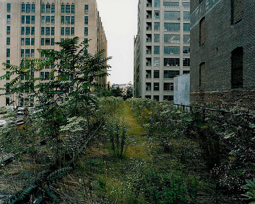
Rut Blees - Luxembourg 


Luxembourg portrays the idea of waste in the city the idea of garages and abandoned houses gives us a sense of poverty of an area which abandoned architecture portrays to the viewer. This is the style of photography I want to create but instead of looking at the abandonment of houses and garages I want to focus on the waste of the high street in the Medway area. Focusing on the closure of stores.

Street Artist : EVOL


I came across the work of street artist EVOL on the internet and found his work relevant and inspirational to the theme I am creating work on. I am particularly  inspired by image two the lighting in this image portrays the sense of abandonment as if there is no sense of human intervention an abandoned town.

Artist : Robert Pollidorri


This image is from the series 'After the flood, 2006' this was taken immediately after Hurricane Katrina this image portrays the mood and feelings across America it shows the devastation of the people. Again I have decided to look at the imagery created by Pollidorri as he shows the abandonment of an interior space. The lighting in this image is something which draws the viewer into the image the lighting portrays the mood of the image and allows the viewer to feel a certain way and feel the mood which was felt by American's in 2006.


Development of photos - Digital 


I have started to take photographs towards the theme of this project looking at waste I have started to look at the idea of waste of an interior space looking at houses at commercial space which has been left doing nothing. I particularly am fond of the middle two images of the waste found on the high street. I captured this photographs using an aperture of f.8 and a shutter speed of 500th of a second also using a film speed of ISO 400.  


Artist : Jeffrey Stockbridge 


I decided to start looking at Jeffrey Stockbridge's work at his view on abandonment. I particularly am fond of image two  the use of the old railway line and the buildings in the background portray to the viewer a sense of abandonment of this area of the world. The lighting of this image helps to demonstrate to the viewer that this is a area of abandonment an unwanted place in this community.


Artists : Yves Marchand and Romain Meffre


This body of works by Marchand and Meffre particularly highlights the style of work in which I want to start creating and highlight for this project under the theme of waste. Even though image two does portray the idea of waste of architecture I feel that image one demonstrates the idea I want to reveal in my photographs the waste of commercial space found in particularly on the high street. Again the use of lighting found in the imagery adds emotion into the body of work and portrays the emotion of the area.

Muldenstein 


A number of factories were abandoned and closed at the start of the economic crisis. I sourced this image from the website Kraft art in which it looks at the collapse of the Eastern Europe industries. I found the imagery on this website looked closely at the theme I have chosen to peruse for this projects. 


Artist : Alex Awramenko


The above imagery by Awramenko looks closely at the theme of waste but portrays it a different way looking at the abandonment of objects. I decided to look at his work as I was intrigued by the lighting source he used for this body of work. I particularly am intrigued by image one and the variety of colour found in the imagery.


Saturday, February 11, 2012

Seminar One Task

Compare and Contrast two paintings ' Giorgione - The sleeping Venus 1510 and Manet - Olympia 1863.' Comment on the context and the relationship of the image to the idealised and realism.


Fig 1 Giorgione The sleeping Venus 1510


Fig 2 Manet Olympia 1863

Giorgione has constructed an image that creates an idea of woman of that era being idealised is this a realistic representation of that time in history. Where as Manet has created a painting which represents reality of that specific time in history which can be seen through the use of the black woman also painted in the image. The black woman is represented as a servant to the white woman on the bed which is a well known fact of that era that black poorer women were servants to wealthier families. Giorgione's painting clearly represents the style of painting of that time period the use of where the body is located suggests and implies the idealised and wants the audience of that time period to believe that this is the style of life this woman lived. 
The aesthetics found in both paintings clearly represent the characteristics that the artist wants to illustrate about each sitter. Firstly, the location demonstrates the style of life the sitter lives. Figure two by Manet represents and allows the viewer to understand the background of the sitter through the use of the green drapes the drapes represent a wealthy woman of the early nineteenth century.
Secondly, the use of sheets also indicates the time era of the paintings and allows the viewer to understand the sitter. The use of silk plain sheets and the positioning of the body gives us the viewer and understanding of the type of person that the sitter is we do get a sense that she is a very sexual person the use of her arm lifted behind her head and her right arm by her groin gives the viewer an insight into her sexuality. The title of the painting means the goddess of beauty, love and fertility is portrayed through the use of the aesthetics and the positioning of her body. Where as figure two portrays a different thought to the viewer the sheets found in this painting portray a sense of virginity this thought came from the use of pure white sheets that the sitter lays on. The body positioning of this sitter seems more insecure even though she is looking at the artist and wants to be in control the use of aesthetics portray a different view.
Overall, I feel that these two paintings show a similar style of painting which is portrayed through the use of aesthetics found in the imagery but they portray two completely different meaning to the viewer. The paintings take a close look at the idea of realism and the idealised which I have taken a close look  at to compare both paintings. 


Wednesday, February 8, 2012

The Commission - Portrait task

The Portrait Seminar task 

Finlay Mackay ' Changing Pace David Weir' For the Road to 2012
Ulrich Gebert, 'Freischneider' 2004
Toby Glanvile, 'Actual Life' 2002 ( no image available)


Finlay MacKay         


After studying the above photography I investigated each photograph and the similarities and dissimilarities found in the imagery. All three images have a clear connotation with the theme of uniform found in Portraiture they also connect with the idea of nature.
Image three by Glanville practically doesn’t connect as well as the other two images found together. The colours found in this imagery come across as very bland as if there is no life the colours feel as if they have been neutralised as if the colour has been removed.
All three images use a large depth of field in order for the whole photograph to be in focus. Even though the whole photograph is in focus the personality of the sitter comes through to the viewer which allows us to connect with the focal point. The narratives of each sitter photographed caught in the imagery and allows the viewer to understand the characteristics of the sitter. The camera positioning of the camera differs from each portrait. Image one an action photograph is taken from a farther distance compared with the other two portraits Mackay seemed to want to capture the environment the athlete was surrounded by through out training is this the mind set when it comes to competing.  I found the Mackay in particular had a certain style of producing his photography he wanted to incorporate elements outside of what the public usually see but portray the emotion of the athletes and the physical strain of the athletes up until competition time in June.